
Reading Time : 2 minutes
This is from the pages of our new mag ‘Issue 589’, which is on stands now, available for purchase online, or click here to subscribe and read all of
Tracks premium content!
Something about the 1970s still resonates with me. Of course, it could be that like most of us, I simply like my own era, but I sense there’s more to it than that.
After all, there’s plenty of 20 somethings surfers out there who seem to like it too, going by their copycat haircuts, moustaches, single fins and mung bean personas. Ironically, their nostalgia is based on imagination, hearsay and old photos and films, since they weren’t even born until 20 or 30 years later.
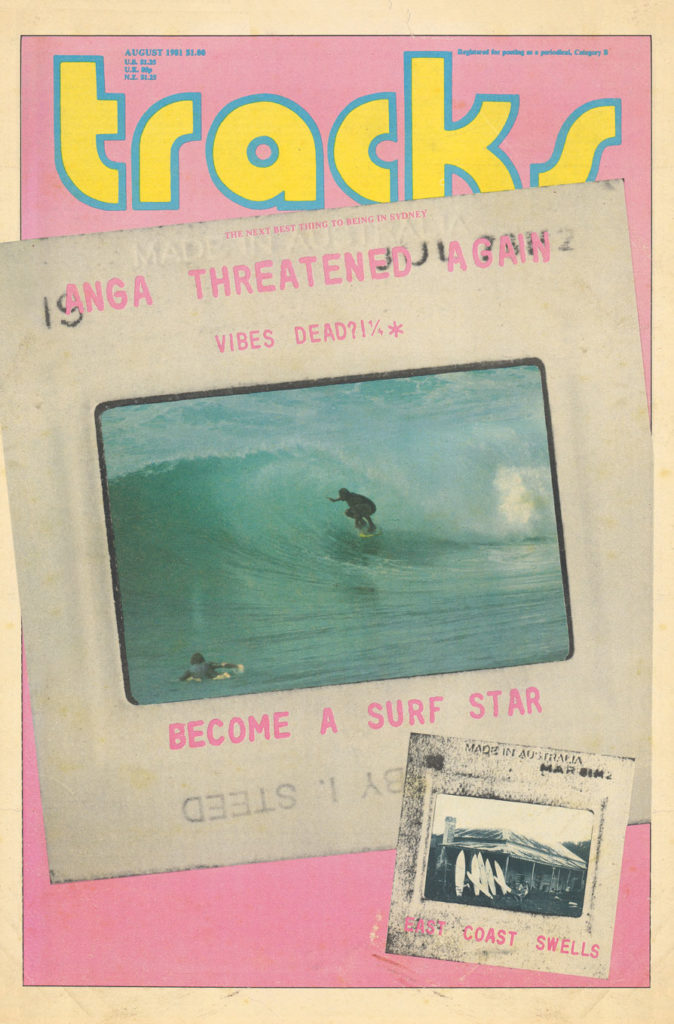
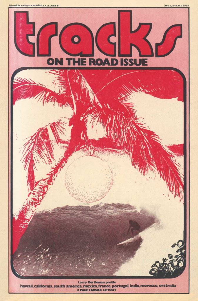
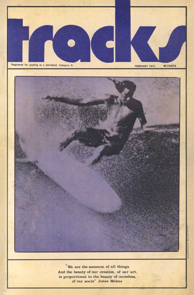
But I lived it, and I loved it. There was a sense of style, and some residual optimism that the high hopes of a better world, spawned in the mid to late 1960s, could still pan out. It wasn’t all empty waves and treehouses at Anga, though. There were dog turds every square metre, steaming durries killing your appetite in restaurants, and women were given less respect than surfboards. But the surf was much quieter, the music created was arguably the most original yet conceived, and people would no sooner take a selfie than punch themselves in the face.
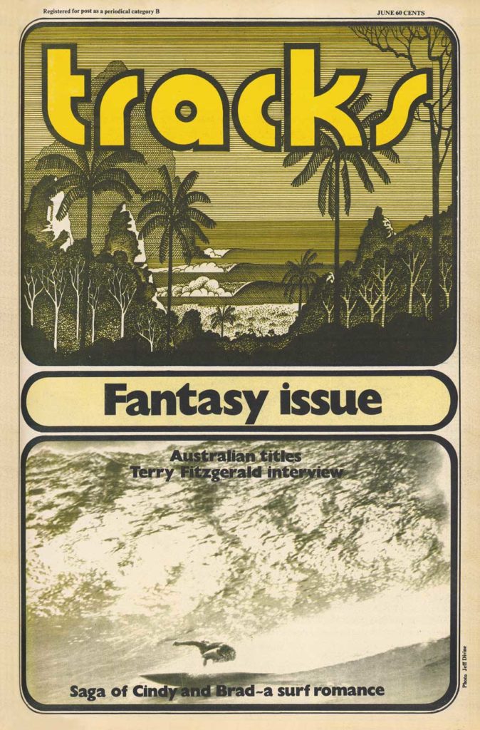
Then there were the old school surfboard logos. They were special. None of yours on the nose (literally and metaphorically)stickers, spruiking soulless corporate behemoths like Nike or Target, or supposed hero surf stars shamelessly selling muck such as those hideous energy drinks to wide-eyed children.
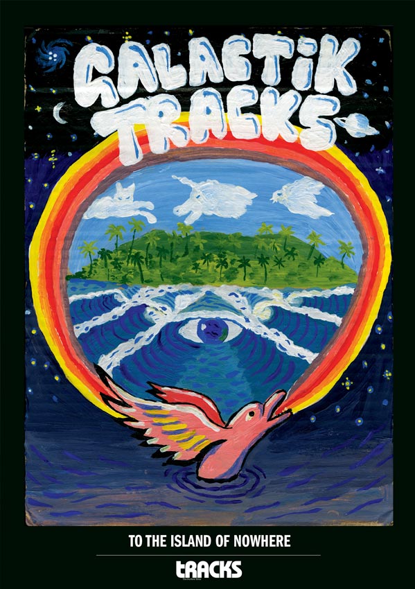
No, the most memorable logos of the 70s were works of art, presented on clean surfboards free of corporate pollution. The Lightning Bolt; the exquisite yin yang symbol of Town and Country; the glorious Michael Peterson fruit bowl; the Skipp Surfboards fantasy sunset line up; and the wonderful Nat Young design, a beautiful naked maiden amongst a lush Garden of Eden. Those desirable images seemed to enhance the already magical feeling of picking up a sleek new board and feeling the sensual curve under your arm, the original test of whether a board was a winner or not.
So, when a couple of my old Indo mates approached me to design an old school logo for their nascent surfboard operation in Bali – in the spirit of those wonderful 70s creations – I jumped at the chance. A price was worked out, a brief given, and I started to tinker. Naturally, it was always going to be rendered in watercolour, which fortunately seemed to really embrace the mood of what we were after. The plan was to rough sketch some possibilities before committing to a final design, but as so often happens when painting in a no consequence frame of mind, one of the ‘rough’ sketches hit the spot; no final, formal painting was necessary. Kind of like the way a practice golf swing is usually better than the actual hit.
The boys loved the final design, and I can’t wait to see it on a finished surfboard – it’ll feel like 1974 all over again.
This is from the pages of our new mag ‘Issue 589’, which is on stands now, available for purchase online, or click here to subscribe and read all of
Tracks premium content!